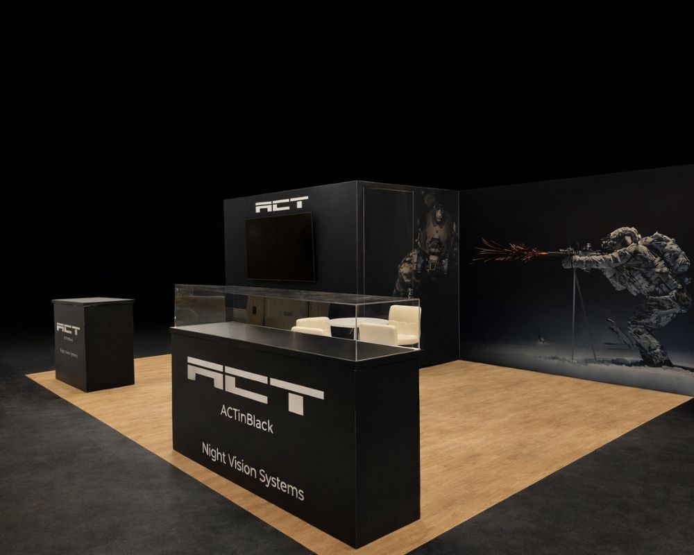
The biggest booth rarely wins. The most legible one does.
71% of attendees say visual presence from across the hall is the main reason they walk into a booth they never planned to visit, and those unplanned stops account for 54% of the purchases and follow-up conversations that start on a show floor.
Below, we break down:
- Designing for the 100-foot glance
- One message readable in seconds
- Lighting and color that pull eyes
- Demos that stretch dwell time
- Floor position and traffic flow
At Local Exhibits, we install 500+ booths a year. Most of what follows comes from watching what actually works on the floor.
Designing for the 100-Foot Glance
Most booth design happens on a monitor. Someone zooms to 100%, admires the logo placement, approves the file, and ships it.
Then the booth goes up in a hall the size of six football fields, and nobody sees it from more than fifteen feet away.
Distance is the variable everyone forgets. Your booth needs to work at three ranges at once, and each one demands something different.
The Three Viewing Zones
| Zone | Distance | Job | What Carries It |
|---|---|---|---|
| Beacon | 60 to 100+ ft | Get noticed above the crowd | Hanging sign, tower, lighting, mass |
| Identify | 20 to 50 ft | Answer “who are you, what do you do” | Backwall headline, logo, color block |
| Engage | 3 to 15 ft | Start the conversation | Product, demo, staff, close-up copy |
Fail the beacon zone and the other two never happen. Most exhibitors over-invest in engage and starve the top of the funnel.
Size Your Type for the Distance
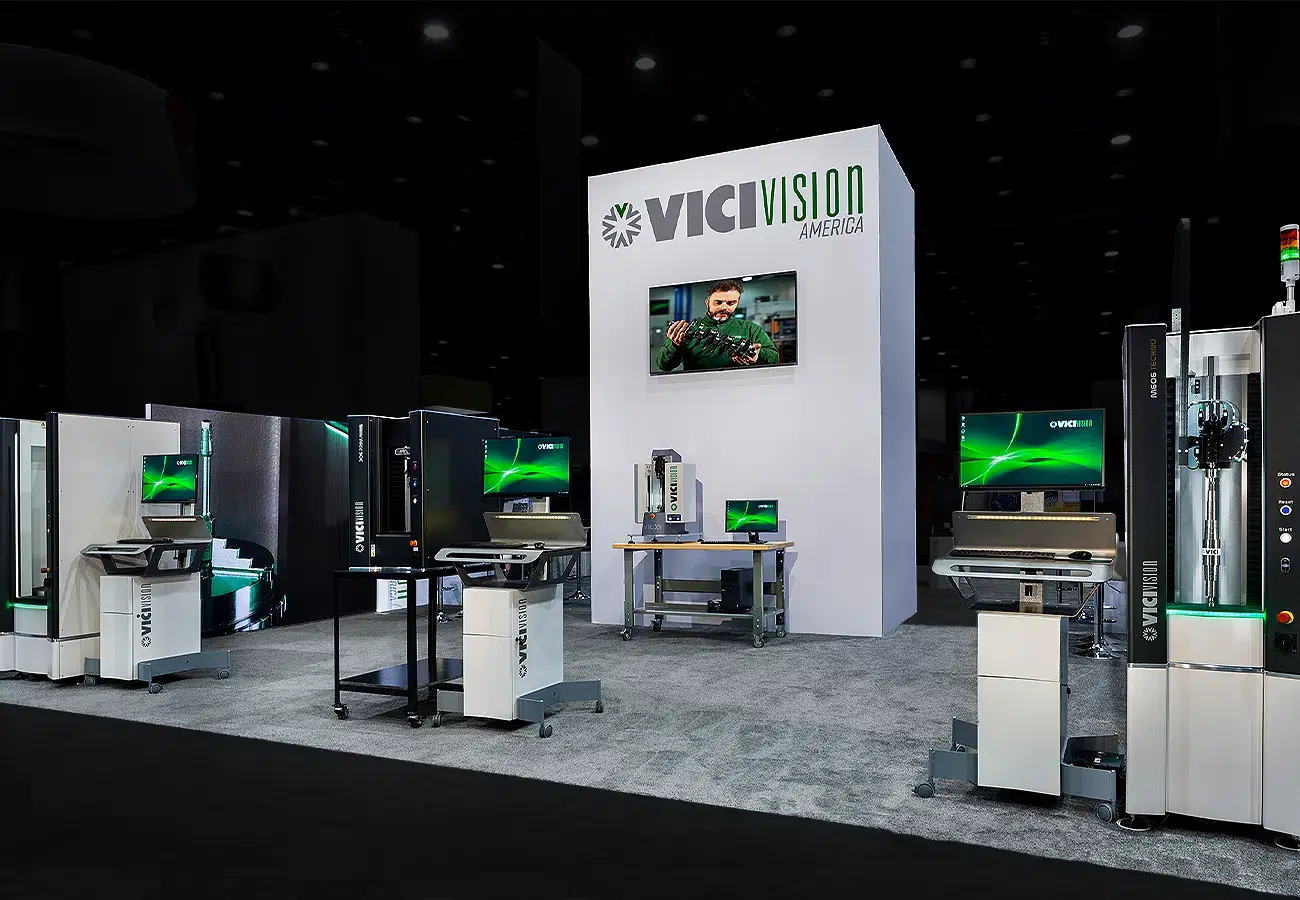
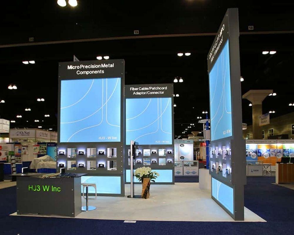
Signage pros use a simple ratio: add one inch of letter height for every 10 feet of viewing distance. Text meant to be read from 150 feet needs to be at least 15 inches tall.
Run your numbers against this:
| Letter Height | Readable From |
|---|---|
| 3 inches | 30 feet |
| 6 inches | 60 feet |
| 10 inches | 100 feet |
| 18 inches | 180 feet |
Two rules that make the ratio work harder:
- Keep copy at 40% of the panel. Roughly 60% should stay open so the words can breathe.
- Go bold and sans-serif. Thin letterforms fall apart at a distance, and clean faces like Helvetica or Futura hold up where script fonts turn to mush.
Print your headline at full scale, tape it to a wall, and walk backward until it blurs. That number is your real visibility range, not the one in the mockup.
Own the Airspace Above You
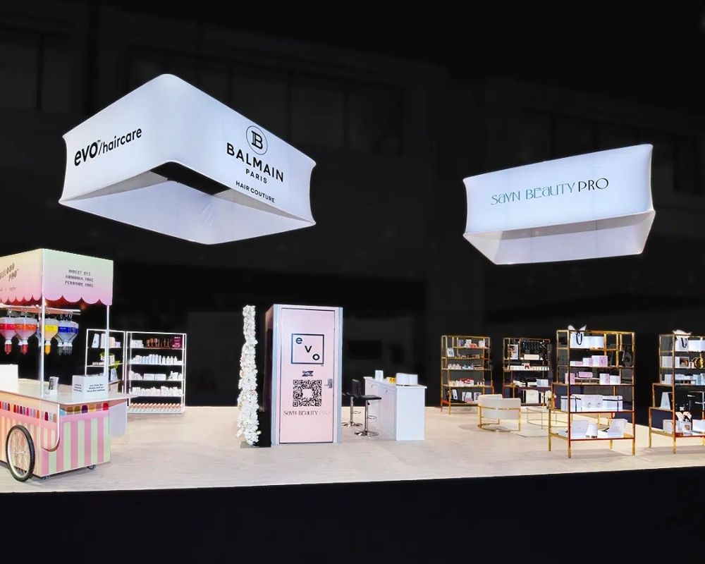
Ground-level graphics vanish the moment the aisle fills with people. Overhead signage does not.
A suspended sign projects your brand above the crowd and holds visibility from every direction, which is why it functions as a wayfinding beacon rather than a decorative logo. Hang it right, and you get clean sightlines the venue’s vertical space gives you for free.
Two constraints to check before you spend a dollar:
- Booth type decides eligibility. Hanging signs are generally permitted for peninsula and island booths only. Inline, corner, and perimeter booths do not qualify.
- Height caps vary by show. Common ceilings run 16 to 18 feet measured from the floor to the top of the sign, but the exhibitor manual is the only source that counts.
Low ceiling in your section? Go wide and horizontal instead of tall and vertical. You stay closer to eye level and keep the sign readable.
Height Rules That Shape Your Design
Line-of-sight regulations exist so one exhibitor cannot wall off a neighbor. They also quietly dictate what your booth can look like.
| Booth Type | Max Height | Hanging Sign |
|---|---|---|
| Linear/inline (10×10) | 8 ft, rear half only | No |
| Perimeter | 12 ft, rear half only | No |
| Peninsula | 16 to 20 ft center, 4 ft near side aisles | Yes |
| Island (20×20+) | 16 to 20 ft throughout | Yes |
For linear booths, the common standard restricts anything over 4 feet in the five-foot strip closest to the aisle, so attendees standing mid-aisle keep a clear view into the front of the booth next door.
The detail that catches people out: product displays count toward height limits. A tall monitor stand, shelving unit, or piece of machinery can trigger a sightline violation even though it is not a wall. Show management can make you move it on install day.
Our design and engineering team reads the exhibitor manual before the first sketch, because a beautiful 12-foot tower is worthless if it gets flagged at 7 a.m. on move-in day.
Working Inside an 8-Foot Ceiling
If you are in a standard inline booth, the beacon zone is legally closed to you. So compete on a different axis:
- Backlit tension fabric. A lit panel reads brighter than a printed one from 40 feet out, even at 8 feet tall.
- Extreme contrast. One saturated color against white cuts through a hall of gray and blue.
- Vertical typography. Stack a short word floor to ceiling instead of running it horizontally.
- Floor graphics. Attendees scanning a crowded aisle look down more than you would think.
- Negative space. An uncluttered 10×10 reads as confident. A packed one reads as noise.
Brands that exhibit at several shows a year hit this wall repeatedly, since the same graphics package has to survive an island layout at one show and a 10×20 inline at the next. That is where a modular system earns its keep, reconfiguring to fit different footprints without a fresh build every time.
The Squint Test
Before anything goes to print, run this on the 3D render:
- Shrink the render to thumbnail size on your screen.
- Squint at it. What still reads?
- Cut everything else from the top of the design.
If your company name and your value proposition do not survive step two, the booth will not survive the show floor. Add the fine print back at eye level, where people actually stand close enough to read it.
One Message Readable in Seconds
Walk any exhibition booth row and count how many you can decode without stopping. Usually a few people manage it. The rest ask you to work for the information, and nobody on a show floor is willing to work.
Your back wall gets one sentence. Spend it well.
The Five-Word Test
Write what your company does in five words or fewer. If you cannot, your booth cannot either.
That single line becomes your largest graphic. Everything else on the wall drops a tier below it in size, weight, and contrast.
A simple message beats a clever one every time, because 92% of attendees come to shows specifically to discover new products and solutions. They are scanning for relevance, not admiring copywriting.
What Your Back Wall Must Answer
Three questions, in this order:
- Who are you? Logo, sized for the identify zone.
- What do you do? One clear message in plain language.
- Why should I stop? A specific benefit, a new product, or a special offer.
Anything beyond those three belongs at eye level or in a handout.
Pro tip: replace industry jargon with the words your customers use. “Predictive maintenance software for fleet operators” outperforms “next-generation asset intelligence” because one of them means something.
Build a Visual Hierarchy
Your branded backdrop needs three tiers, and the size gap between them should feel almost aggressive.
| Tier | Content | Relative Size |
|---|---|---|
| Primary | Company name or category line | 100% |
| Secondary | Value proposition or product name | 40 to 50% |
| Tertiary | Proof points, contact info, QR code | 15 to 20% |
When every element sits at the same weight, the eye has nowhere to land. Attendees read nothing and keep walking.
Where the Brand Story Goes
Your brand story matters, but it does not belong on large format signage. Nobody reads a paragraph from 30 feet.
Put the story where people can stand still: a side panel, a looping screen, a tablet at the counter, a QR code that opens a two-minute film. Save the wall graphic for the hook.
Consistency does the rest of the work. Branded graphics that match your website, your deck, and your booth staff shirts create recognition that a one-off design cannot. Our 2D design team builds the full package as one system so the important graphics carry the same voice from the hanging signage down to the counter face.
Lighting and Color That Pull Eyes
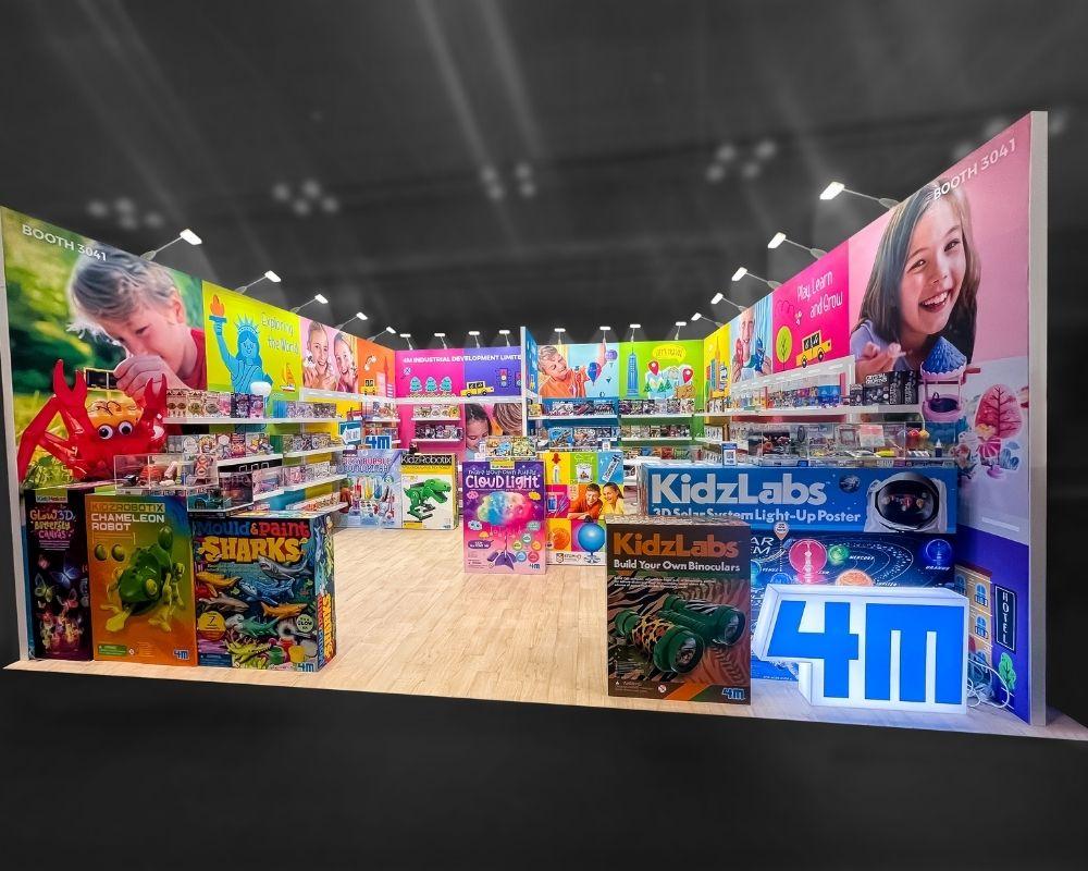
Convention halls are lit like warehouses. Flat, gray, and unflattering to every color you approved on a calibrated monitor.
Lighting is the cheapest way to look expensive. It is also the most skipped line item in the budget.
Layer Three Types of Light
Professional exhibit lighting works in layers, not a single overhead wash.
- Ambient. Fills the space and sets the overall mood.
- Task. Lights the counter, the demo station, the seating area so people can actually function.
- Accent lighting. Spots your product, your headline, or your call to action.
Accent lighting is the workhorse. It guides attention exactly where you want it and quietly directs movement through the space. Bright, well-lit booths also read as professional and open, while dim ones read as closed for business.
Warm light suits lifestyle and hospitality brands. Cool, crisp light suits technology and medical. Softer, layered light can create a calming atmosphere that makes people willing to sit down, which matters more than it sounds when the hall is loud.
The 60/30/10 Color Split
A workable ratio for exhibition booth color: 60 to 70% primary brand color, 20 to 30% secondary, and 5 to 10% accent reserved for calls to action and focal points.
Three bright colors is roughly the ceiling. Past that, nothing stands out because everything is competing.
| Color | Signals | Works For |
|---|---|---|
| Red | Urgency, energy | Launches, promotions, limited offers |
| Blue | Trust, stability | Tech, finance, healthcare |
| Green | Growth, sustainability | Eco brands, wellness, agriculture |
| Yellow | Optimism, visibility | High-traffic attention grabbing |
| Purple | Premium, refined | Luxury goods, high-end services |
| Black + white | Clarity, contrast | Any brand needing legibility |
Roughly 48% of exhibitors report that eye-catching displays are what draw attendees more than any other factor. Contrast is what makes them eye-catching, not saturation. High-contrast pairings stay readable from a distance where a tasteful tonal palette turns into mush.
One caution: venue lighting distorts color. Fluorescents mute reds and push yellows. Test your palette under conditions close to the hall before you print, or accept whatever the ceiling gives you.
Budget Options That Punch Above
You do not need a projection budget to compete.
- Animated LED strips along edges and shelving draw attention for a few hundred dollars.
- Backlit fabric panels make an 8-foot wall read like a lightbox.
- Uplighting on a tower or column adds height without adding structure.
- Projection mapping turns a flat surface into moving visuals, and 3D projection mapping can make the booth itself the interactive element.
Sensory Design Is Not Just Visual
Engaging more than one sense deepens recall, and multi-sensory environments are commonly credited with lifting memory retention by around 65% compared to visual-only experiences.
Sound, texture, and scent all count. A soft fabric wall, a wood counter, background audio at conversation level, coffee brewing at the corner of the booth. These are small choices, and they are the ones people describe later when they cannot remember your company name.
Restraint matters. There is a line between an immersive space and overwhelming visitors, and it arrives faster than most brands expect.
Demos That Stretch Dwell Time
Trade show attendees spend an average of 8.3 hours viewing booths across a single exhibition. That is a full workday of available attention distributed across hundreds of competitors.
Your share depends on whether anything in your booth is worth stopping for.
Live Demos Stop People Cold
Nothing beats watching a product do the thing it claims to do. Live demos work because they answer the buyer’s real question, which is whether your product actually solves their problem.
Structure the demo like a broadcast:
| Element | Target | Why |
|---|---|---|
| Length | 5 to 8 minutes | Short enough to join mid-run |
| Frequency | Every 20 to 30 minutes | Predictable, promotable |
| Audience space | Room for 6 to 10 | Crowds draw crowds |
| Hook | First 30 seconds | Decides whether they stay |
Post the schedule on a sign. A visible start time gives passersby a reason to come back, and a small crowd is the single best tool to draw people who were not looking for you.
Bulky equipment demos need power, rigging, and floor loading worked out well before install. Our show services crew handles that coordination on site so the demo runs on schedule instead of waiting on a forklift.
Interactive Screens and Games
Interactive screens invite the kind of hands-on engagement that passive signage cannot. Touch a screen, configure a product, see your own numbers on a dashboard, and the experience becomes yours instead of theirs.
Gamified activities do double duty. A quick quiz, a spin wheel, a leaderboard challenge, or a prize draw makes lead capture feel like play, and the questions you build into the game qualify the lead while the person is still smiling.
Ideas that consistently attract visitors:
- A quick quiz scored against industry benchmarks
- A racing or accuracy game branded to your product
- A configurator that emails results to the player
- A prize draw with an entry that doubles as a survey
Create a Photo Moment
Photo moments turn attendees into distribution. A branded wall, an oversized prop, a light installation, anything people want to be seen standing in front of.
Every post carries your name to an audience that never walked the hall. Add a hashtag and a printed frame, and social sharing becomes a measurable channel rather than a happy accident.
Giveaways People Keep
Most swag ends up in a hotel trash can. The exception is anything useful, portable, or personal.
| Budget Level | What Works | Who Gets It |
|---|---|---|
| Low | Water bottles, quality pens, phone stands, snacks | Open floor |
| Mid | Branded totes, cables, notebooks | Engaged visitors |
| Premium | Personalized items, sample kits, gift cards | Warm leads and key prospects |
Personalized giveaways get kept and shown to other people, which is why a name-engraved item outperforms a stack of identical ones. Reserve the premium tier for qualified conversations rather than handing it to anyone passing.
Bonus tip: anything that must be carried through an airport should fit in a laptop bag. Heavy or awkward items get abandoned at the venue.
Staff Make or Break the Booth
The best booth experience in the hall dies if the team is looking at their phones.
- Greet within five seconds. A prompt hello converts a glance into a stop.
- Ask open-ended questions. “What brought you to the show?” sparks conversations that “Can I help you?” shuts down.
- Stay standing, stay out front. Seated staff behind a counter reads as a barrier.
- Rotate every two hours. Energy fades, and attendees can tell.
Lead generation only pays off with a plan for what happens after. Set up scanning, tag leads by temperature during the conversation, and agree on a follow-up window before anyone flies out. A lasting impression with no follow-up email is a donation, not a campaign, and measuring booth performance is what turns one good show into a repeatable program.
Floor Position and Traffic Flow
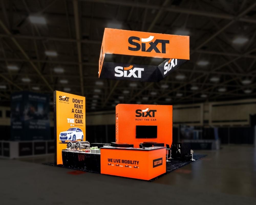
Nobody talks about this, and it may be the highest-leverage decision you make. The same booth in two different locations produces two different results.
You are buying an audience, not a rectangle.
Where to Buy on the Floor Plan
Request the floor plan early and read it like a map of human behavior.
Positions that work:
- Corner booths, with two open sides and roughly double the sightlines
- Near main entrances, though people often walk past before settling in
- Along paths to food courts, restrooms, and charging stations
- Adjacent to keynote or session rooms, where crowds surge on a schedule
- Near a large, well-known exhibitor whose gravity pulls foot traffic your way
Positions to avoid:
- Dead-end aisles and back corners
- Directly behind a large structure that blocks your sightline
- Beside a loud demo that will drown out your conversations
- Isolated pockets with no anchor tenant nearby
Booth size interacts with position, so it pays to settle both together. Our guide to trade show booth sizes covers what each footprint can realistically hold.
Open Layouts Beat Walled Ones
A counter across the front of your booth is a wall. It says talk to me from the aisle.
Open layouts invite people in, which is exactly what you want, because you cannot start a real conversation with someone standing three feet outside your carpet.
Practical moves:
- Pull the counter to one side instead of centering it in the entry
- Leave at least one wide, obvious way in
- Set demo stations deeper so visitors walk into the space to reach them
- Use flooring changes and lighting to mark the threshold instead of furniture
Good rule: if a visitor has to decide where to enter, you have already lost half of them.
Design for How People Move
Attendees walk the floor in predictable patterns. Most drift right, most scan one side of an aisle at a time, and most slow down where the aisle widens.
Face your strongest graphics toward the direction of heaviest approach. On a corner, treat both open sides as a front. In a busy aisle where crowd density blocks ground-level branding, height becomes your only reliable channel, which is where double-deck exhibits and elevated structures earn their premium.
Fill the Booth Before Doors Open
Position gets you traffic. Pre-show marketing gets you the right traffic.
Exhibitors who run pre-show campaigns generate around 46% more booth visits than those relying entirely on walk-up crowds, and it costs nothing structural.
Four moves worth making:
- Email your list with your booth number and one reason to visit
- Book meetings in advance with named accounts attending
- Optimize your exhibitor directory listing since many attendees plan their route from it
- Post your demo schedule publicly a week out
For a small business competing against far larger budgets, this is the most level part of the playing field.
Key Takeaways for Floor Position
- Choose trade show space by traffic pattern, not by price per square foot
- Corners and paths to amenities outperform interior aisles
- Open layouts attract visitors, closed layouts filter them out
- Match booth height and structure to the crowd density you expect
- Start planning position and pre-show outreach the moment the floor plan opens
Stand Out On Any Show Floor With Local Exhibits
Standing out is not about spending the most. It comes down to being seen from across the hall, understood in seconds, and worth stopping for. Get those three right and the crowd finds you.
Key takeaways:
- Design for 100 feet first, 10 feet second
- One clear message beats a clever one
- Layer your lighting, limit your palette to three colors
- Live demos and interactive elements hold attention longest
- Buy position on the floor plan, not just square footage
- Pre-show outreach lifts booth visits by roughly 46%
We build booths that do this work for you, from the first sketch through installation and dismantle. Two decades, 500+ installs a year, every show floor in the country. Tell us about your next show, and we will handle the rest.
Frequently Asked Questions
How to attract people to your trade show booth?
Run live demos, offer interactive games, and email your list before the event. Showing your products or services live draws more people than signage alone.
What makes a good trade show booth?
A great trade show booth is visible from 100 feet, readable in seconds, and open to walk into. One clear message, strong lighting, relevant products.
What are some cool ideas for a trade show booth?
Popular trade show booth ideas include photo walls, product configurators, branded games, and live demos. For example, imagine a leaderboard challenge that captures qualified leads automatically.
What are common booth mistakes?
Too much text, dim lighting, counters blocking the entrance, and distracted staff. Poor follow-up ranks worst: leads go cold when no email continues the conversation.